Plotting in Bisque
So I've been working on my Bisque module -- specifically, I'm trying to make the output of the pollen-tube-tracker module immediately useful, at least a bit. (The module generates comprehensive output in CSV or XML form, but no one can read all that at a glance.) Specifically, what our pollen expert requested was a plot of pollen tube velocities, versus time. That sounds like a very reasonable request, no? He sketched out for me a simple cartoon, with one trace per tube, with tube velocity as the ordinate against time as the abscissa:

It turns out, that's not so easy.
How Bisque Works
One reason it isn't easy is because a Bisque module is doesn't get to speak directly to the users. I want to explain what I mean, so here's a little sketch of how the architecture looks from my perspective:
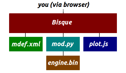
You, the biologist user, are running a browser and working through the interface Bisque provides. In this diagram, I'm "mod.py," a Python script that gets invoked every time the user picks my module to perform an analysis. My job is to mediate between Bisque and the binary executables (represented by engine.bin) that do the hard work. In the pollen-tube case, there are three binary executables, and they expect to run in a Unix environment, with their input in the form of named files (named just so) in a local filesystem. The engines need command-line arguments, and if anything goes wrong they send a message in English to standard output. Whereas Bisque, instead, gives me the URL of the input files. It gives me user parameters in a slightly different format (e.g., sizes could be in microns rather than pixels). It doesn't understand English error messages.
My job (as mod.py) is to be the bridge: download the images from the URLs and save them locally. Adapt the parameters. Run the engines and interpret their outputs. Detect errors. Translate engine output into a Bisque-acceptable response. Like any translator, this means mod.py has to understand both parties' "languages" and sometimes do a bit of extra explaining, but it's not that complicated. The Bisque developers have provided code to help out with the hardest parts, like that of downloading images and uploading XML output. Thus mod.py is roughly 700 lines of python -- not very long.
The high-level interface to the module is defined by a module-definition file, which is mdef.xml in the above diagram. It defines a module's inputs and outputs. This is how, for example, you the user can give me, the script, a bunch of numeric parameters to control the tracker. Inside mdef.xml there is a list of input parameters; when you choose my module, Bisque reads mdef.xml and lets you tweak the parameters before clicking the "run" button. When "run" fires, Bisque shunts those parameters over to mod.py.
So Where's My Chart?
It's not enough to say that mdef.xml spells out the input parameters for mod.py; more accurately, it acts as a contract between Bisque and mod.py. The output from mod.py, which is exclusively XML, must conform to the structure delineated in mdef.xml. So it defines the output interface (from mod.py and to Bisque), too. Bisque by default supports a few kinds of output. The output XML can define an overlay of aggregate graphical primitives (called GObjects) on the input image. You can produce some text-based summary output. And Bisque will always let you have the raw XML, if you ask for it.
If you want a chart, it gets a bit tricky. You can make simple charts by specifying a single xpath, which will extract a single vector of variables from the output. You can plot them, or draw a histogram, or a few other things, but mdef.xml is essentially an interface. An interface should answer the question "what is the output?" rather than "how do we make the output?"
Furthermore, mod.py cannot really generate a plot easily. Its job is to bridge between Bisque and the engine, not to offer reinterpretations of the engine output. (In fact I violate my own advice here a bit, because my module does augment the engine output with a reinterpretation that lacks the time dimension. I call the outputs "time-indexed" and "time-collapsed," because it's easier to visualize the time-collapsed output in Bisque, although the time-indexed one is more complete. It's kind of a hack. If possible I'd like to eliminate that behavior.)
One of the hallowed rules of software design is to separate interface from implementation. In this case, that means separate the user-interface (the charts) from the XML output that is implemented by mod.py+engine.bin. This same principle is one part of the Model-View-Controller architecture: the view and the model should be decoupled. Long story short: it's a dumb idea to shoehorn the plot into mdef.xml or mod.py. We need a new entity: please welcome plot.js, something called a "renderer" by the Bisque devs. As the name suggests, it's a chunk of javascript that runs in your browser, and reinterprets module-output in the form of a plot. It can answer the question, "How do we make this part of the output?" The only requirement is that mdef.xml must cite plot.js as part of its user interface.
Not quite there
After cribbing the javascript renderer from RootTipMulti I was eventually able to produce a plot. It still looks terrible, but I'm making progress: 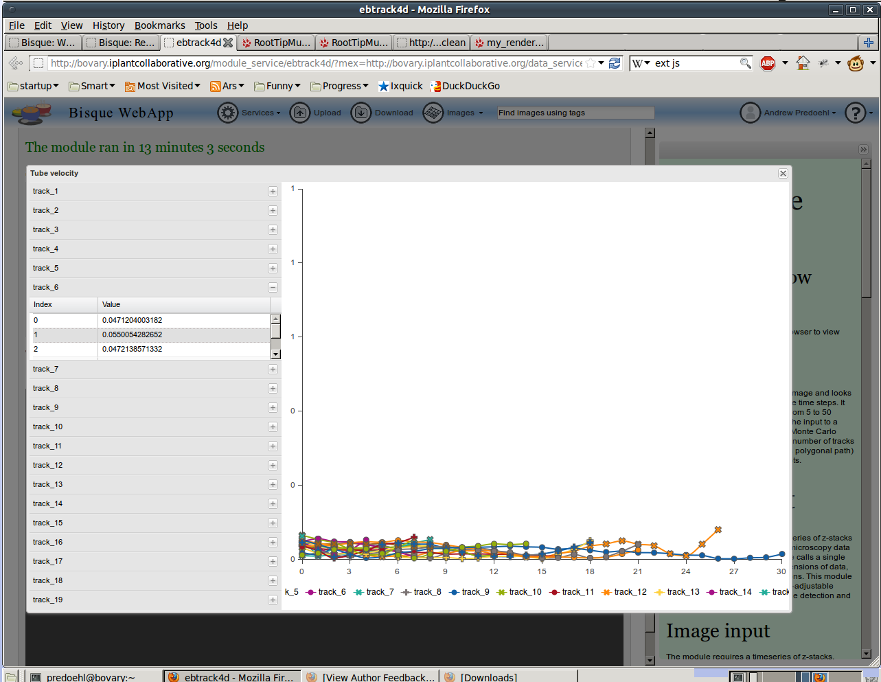
Let's for a moment focus on the positives. I had never written any JavaScript before now. I was unfamiliar with the Bisque interface to javascript renderers until now. I've successfully adapted this module to scrape out tube velocity from the module output. Debugging was difficult here because the JS isn't stored on my server, but it's shipped by Bisque to the end user, so I have to re-run the module for every change. The xpaths generated by the module are interpreted by Bisque, from which the plot is produced, so I'm submitting callback functions and it's all kind of confusing. Yet we seem to have the rudiments of a plot here! I was very glad to see the above plot, after many hours of obscure refusals from Bisque.
However, my 4th grade teacher would weep at the sight of this chart. With the missing labels, the missing units, the numeric formatting, the legends -- it's a trainwreck. So, that's what I've got to improve next, and as usual with Bisque, I don't really know what to do. Apparently the plotting is performed by a JavaScript library called EXT-JS, and obviously its defaults are lousy, so I've got to learn how to make it behave better.